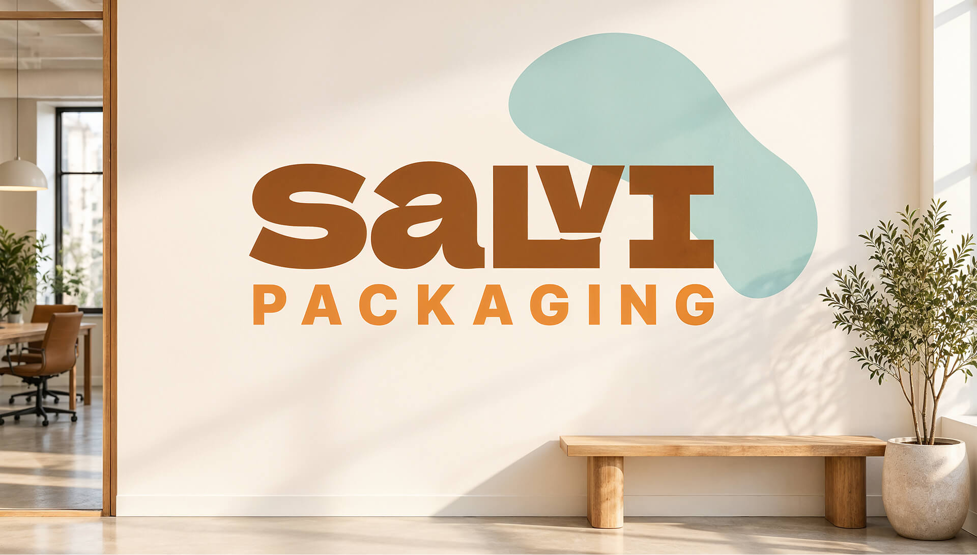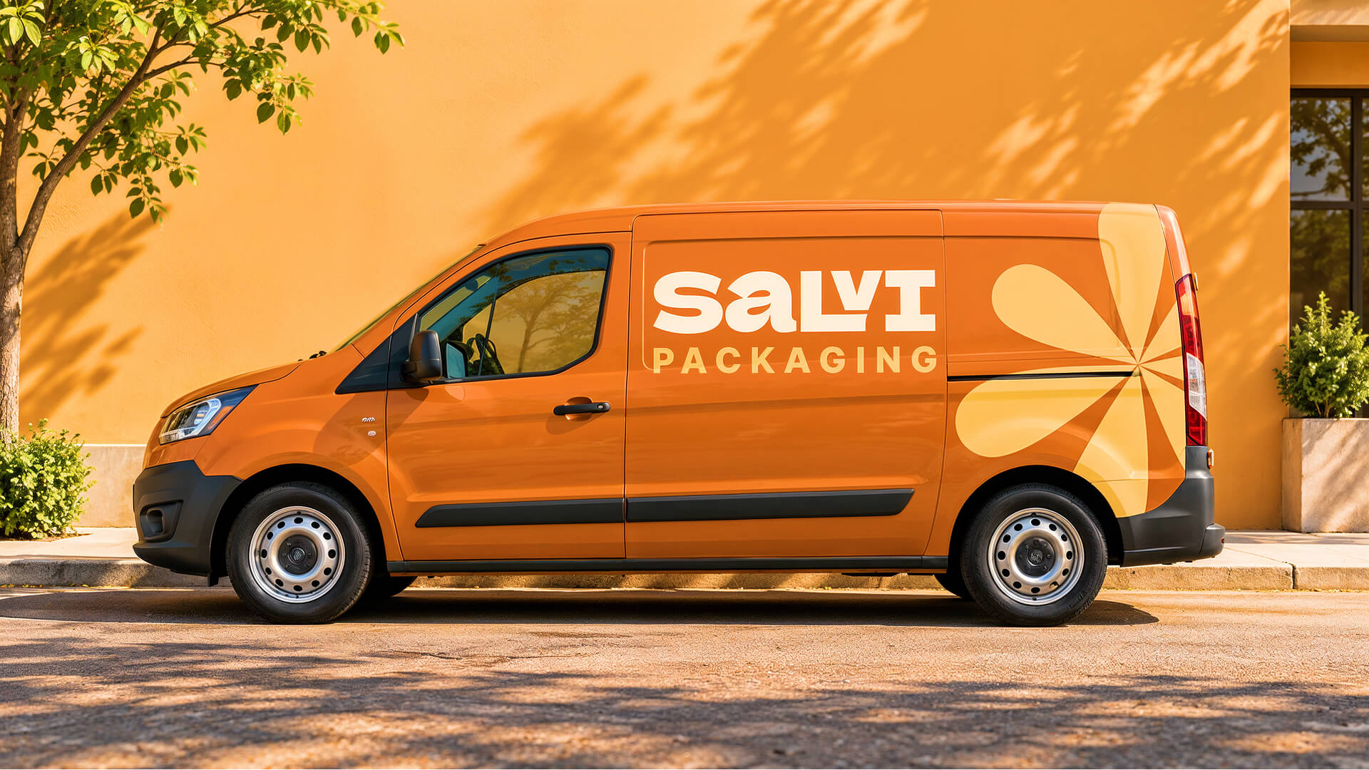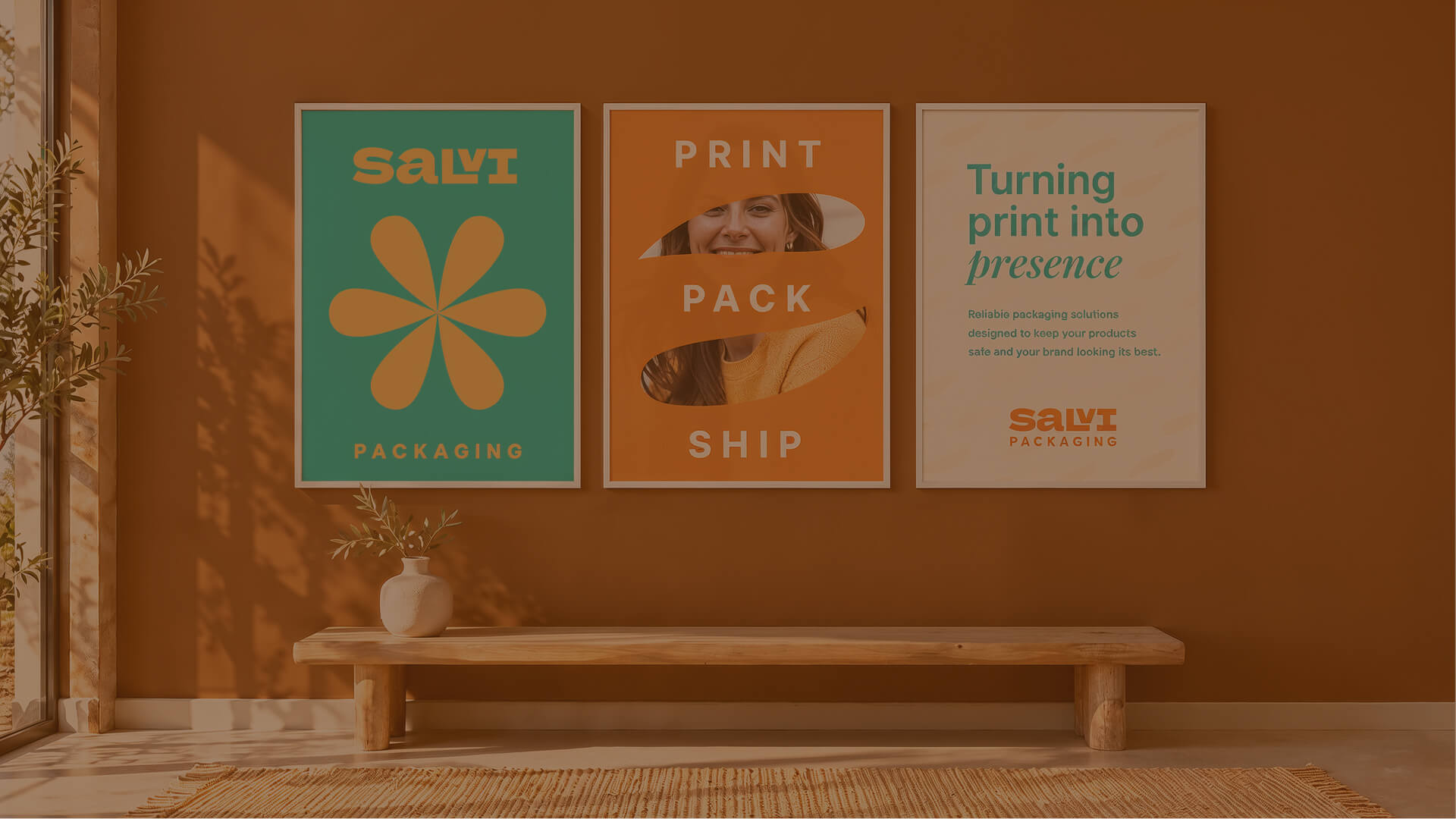
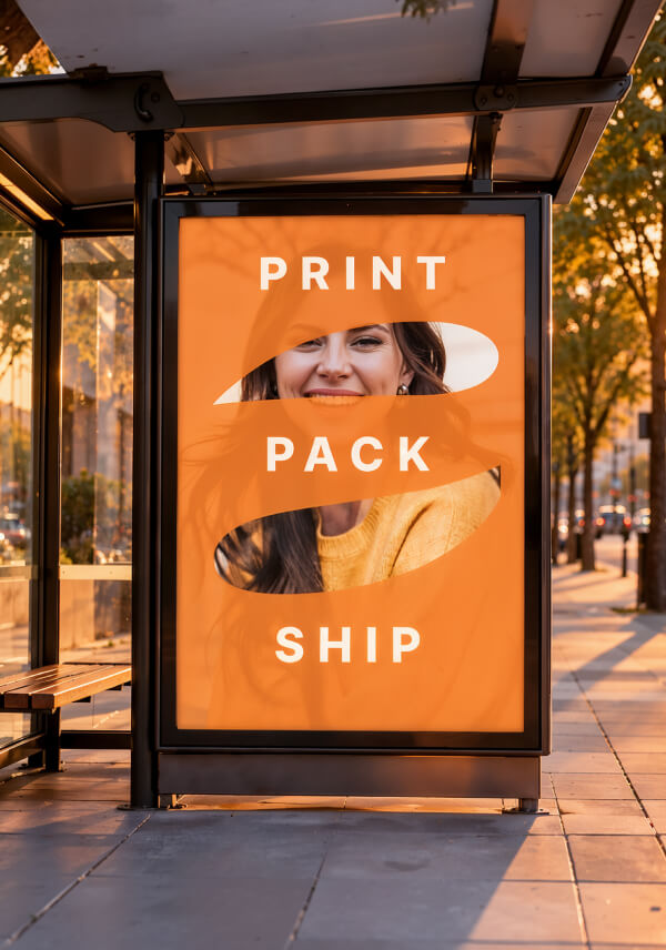
Salvi Packaging helps brands print, pack, and ship with confidence. They create reliable packaging solutions designed to keep products safe in transit and make brands look their best the moment a box lands on a doorstep. For Salvi, packaging isn’t just protection. It’s the first physical touchpoint a customer has with a brand, and that belief shaped the identity from the start: “Turning print into presence.”
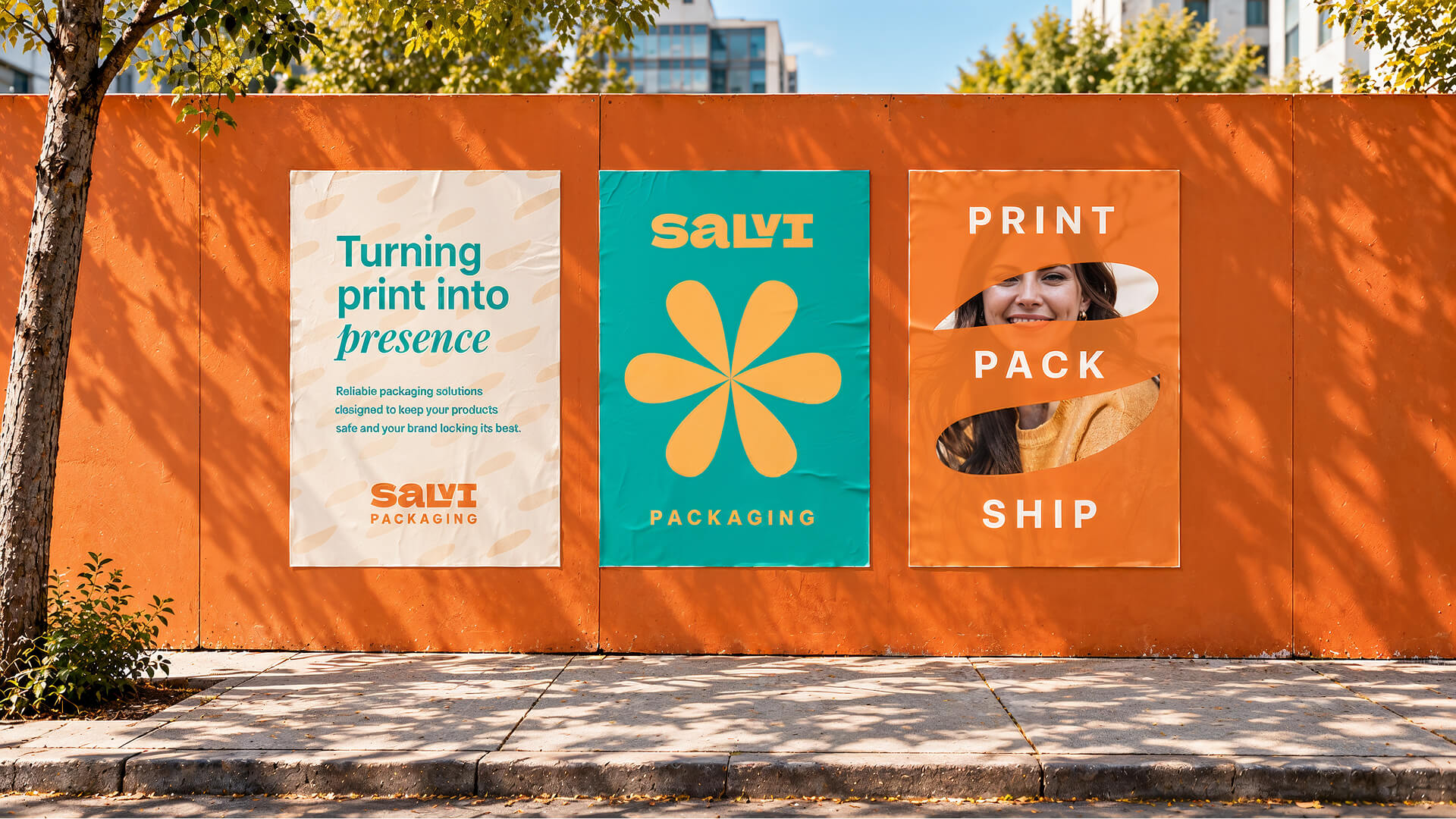
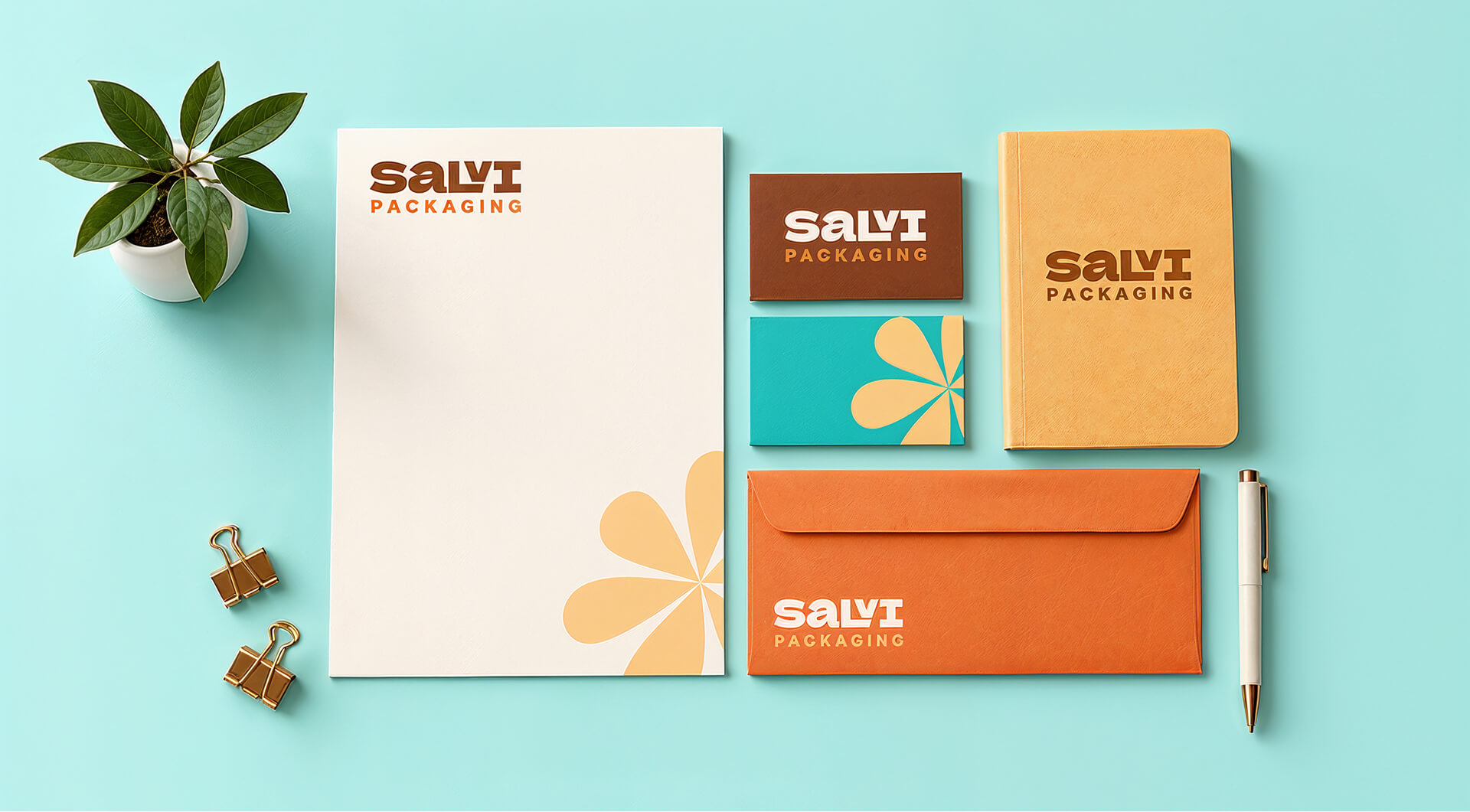
The identity is built on a simple idea: packaging should feel as good as what’s inside it. Instead of the cold, industrial look common in the category, Salvi’s brand is warm and friendly rather than cold and industrial. Toasted Almond and Apricot Cream adds energy, Chocolate Brown brings the earthy feel of kraft, Seashell keeps things clean, and Light Sea Green adds a fresh pop of contrast.
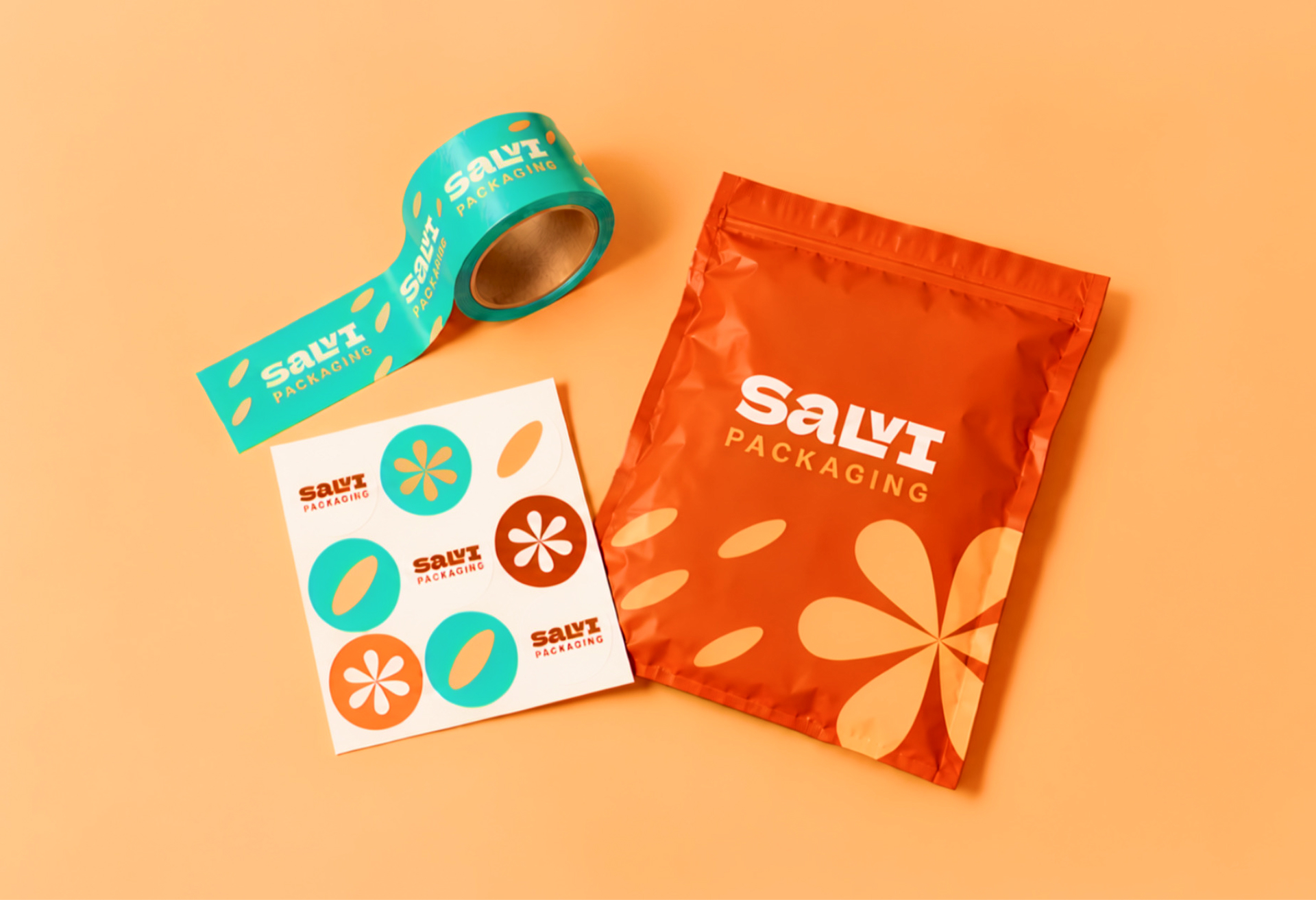
Turning Print into Presence.
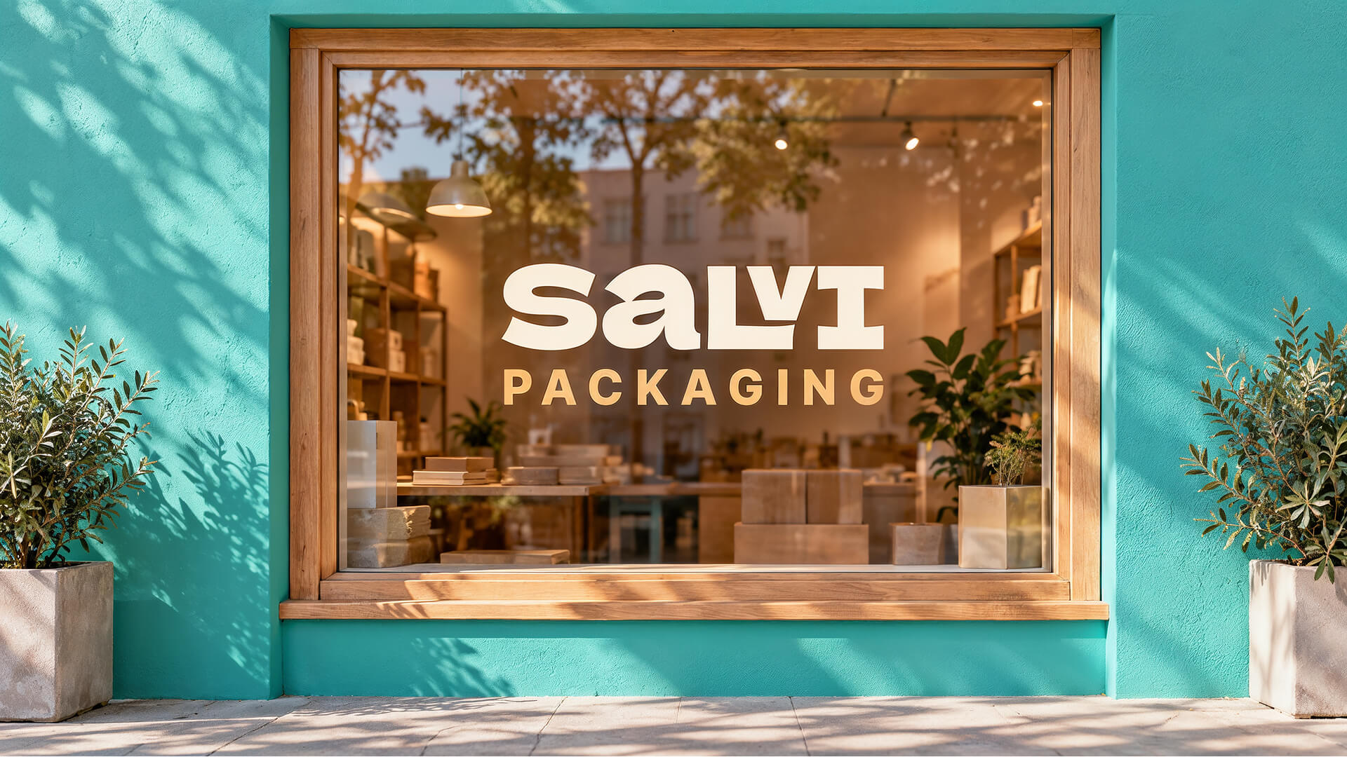
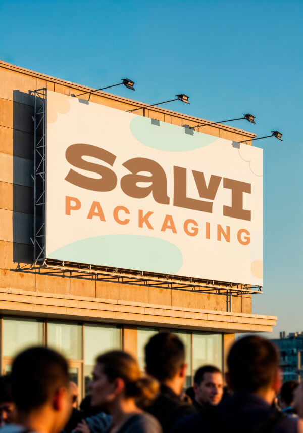
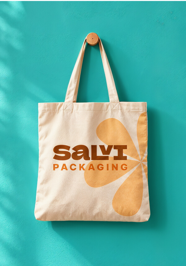
The custom wordmark uses heavy, flared letterforms that feel sturdy and dependable with a playful retro edge. A clean, widely spaced “PACKAGING” balances it with structure, while a system of organic shapes (a six-petal flower, soft teardrops, scalloped edges, and rounded blobs) scales from stickers and tape to full box wraps and posters.
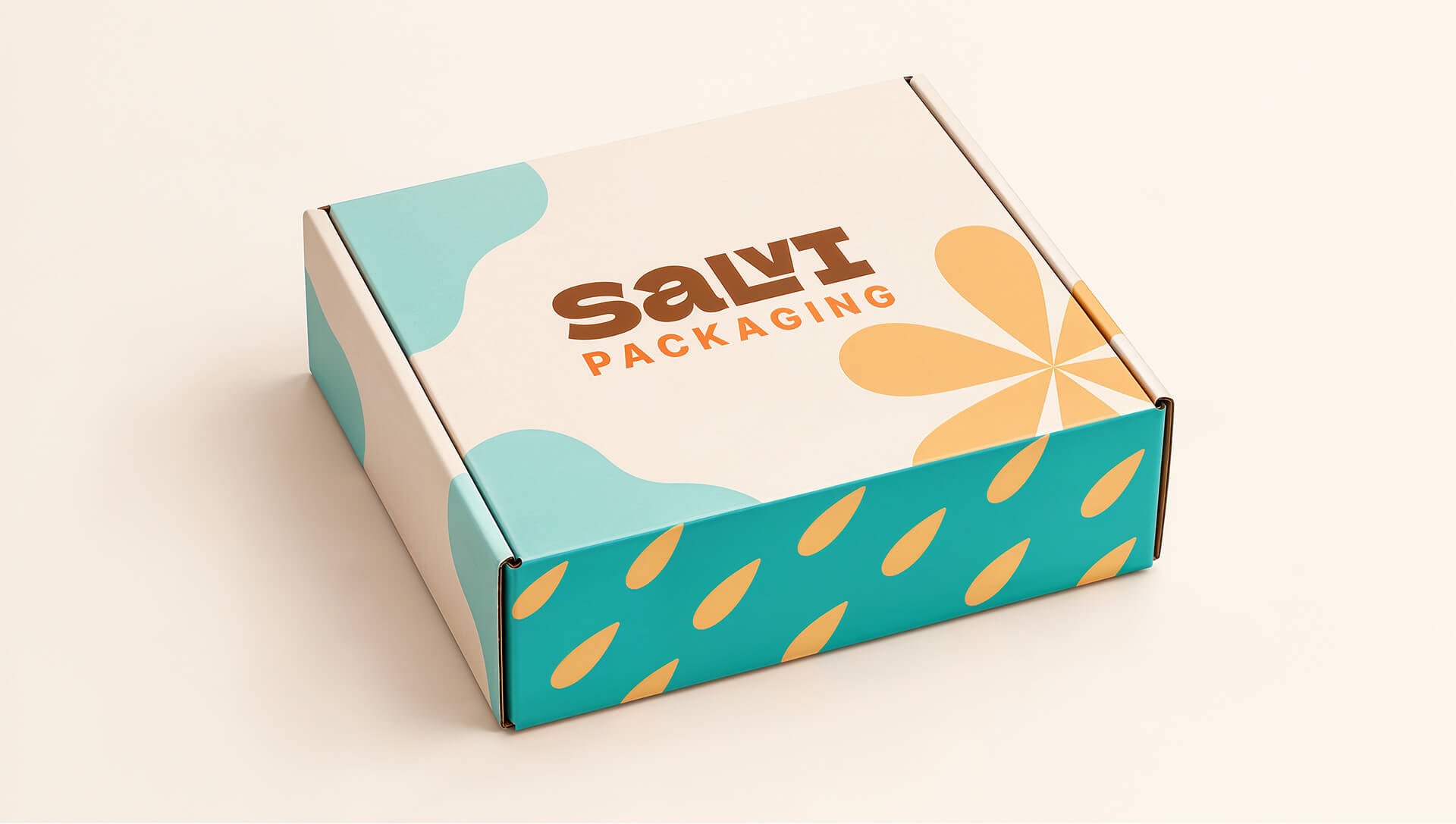
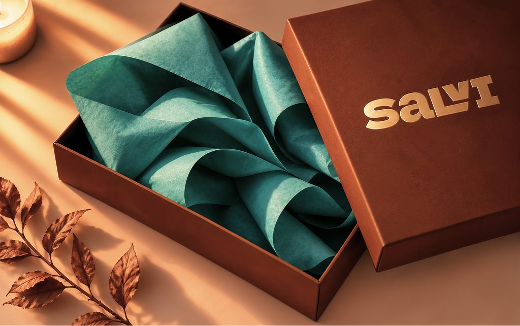
The result is an identity that’s cheerful but credible, bold enough to be remembered and consistent enough to build trust with every delivery.